Android 12 vs iOS 15: Quick settings insight
Android and iOS are the toughest competitors in the smartphone operating system world. One has the most users and the other draws second in the race. Therefore, you can expect healthy competition among them.
However, the latest version from both of these mobile operating systems – Android 12 and iOS 15 draws special attention from the consumers. However, a comparison between them could bring us a good standing point of what is changed over time with their latest versions.
Now, we seek to compare Android 12 and iOS 15 features, starting with quick settings that bring a lot of accessibility for the consumers. The quick setting helps you to get the most commonly used features with the access of your taps.
Android 12:
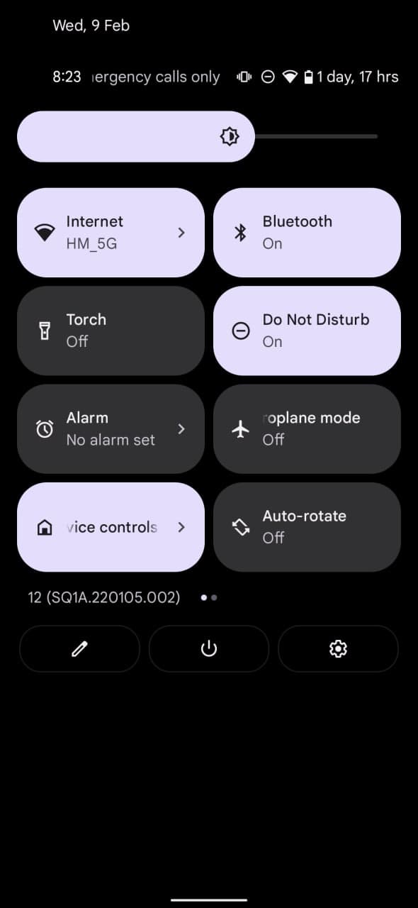
Android 12 comes with a new tile-based quick settings panel that has accessible quick settings icons. The icons are big and touch won’t be missed. The icons alignment is quite simple and arranged in two verticle columns.
These tiles are editable and could be rearranged from one place to another. Aside from some general customizations, the new Android 12 has a Material You design that generates color pallets based on the wallpaper of your phone’s home screen.
These color palettes could apply throughout the user interface of your Android 12 smartphone on the system level. This customization feature is pretty awesome and really appreciatable.

iOS 15:
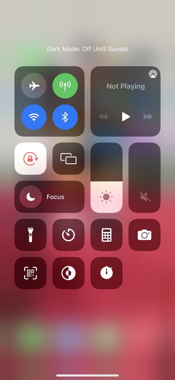
iOS 15 on the other hand, keeps everything simple, the translucent background adds the perfect touch to the overall design of the icons on front. Switch icons are arranged in justified sections for each feature.
In comparison to Android 12, iOS 15 quick settings you get the most done on the same screen without grabbing extra space. On the other hand, Android 12 dials are big and take a bit more space as compared to iOS 15.

The post Android 12 vs iOS 15: Quick settings insight appeared first on Huawei Central.

Post a Comment
0 Comments