EMUI 12 vs Android 13 Beta: Settings menu
Huawei EMUI 12 has new ways to discover and direct users and its new features keep them interactive all the time. However, the Android 13 is also preparing to make its way among Android phone users. This new version of Android has a lot to discover and it’s currently under beta testing for global consumers.
Talking of which, we’re putting Huawei EMUI 12 in action against the upcoming Android 13 in terms of checking the similarities and differences between the user interface of both of these software. In this edition, we’ll compare Android 13 and EMUI 12 together for the Settings menu.
So, without further ado, let’s begin our Android 13 beta vs EMUI 12 settings menu comparison process.
Android 13 beta:
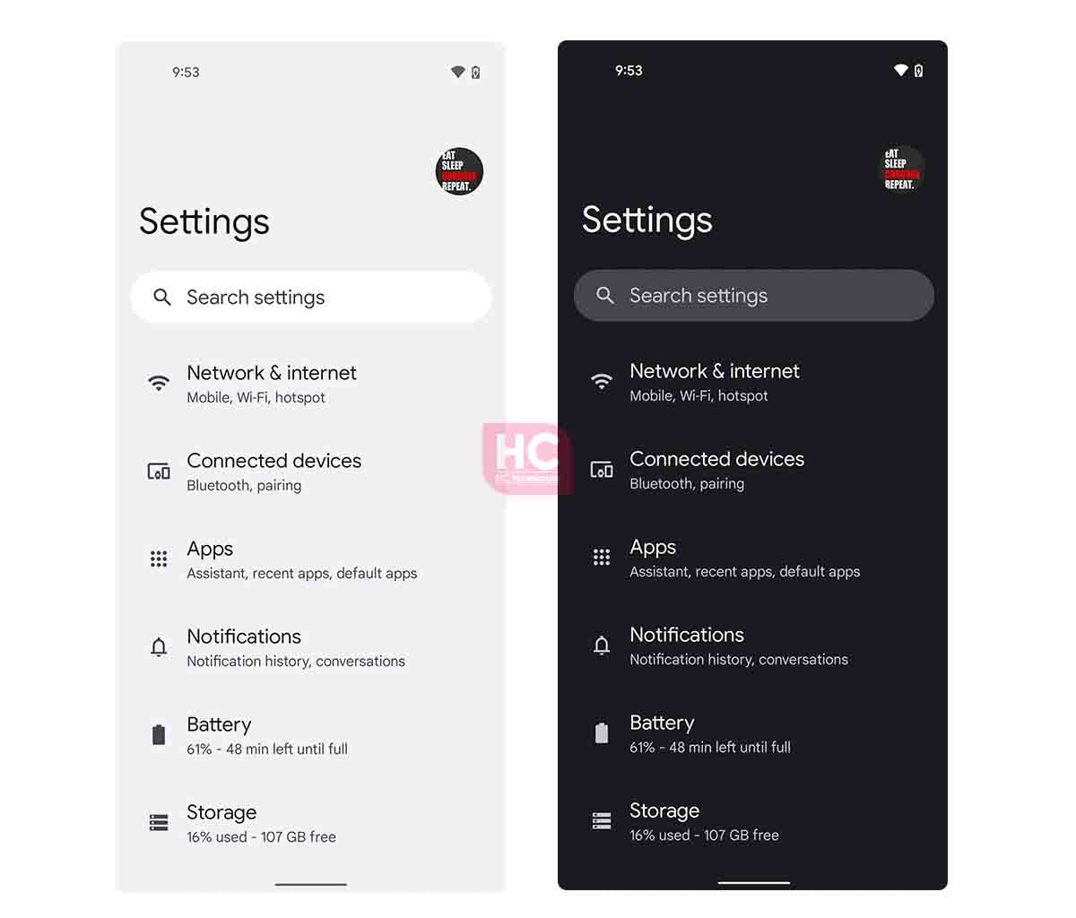
Stock Android 13 has been of the finest creation over Android 12 coming from Google, the Android version is ready to become the base of many OEM’s custom mobile software skins. Coming to the settings menu, the user interface of this screen features subtle text with sufficient contrast and visibility.

Still, we think that the material you or dynamic theme is one of the biggest advantages of Android 13 over EMUI 12, which is one of the most adored features from consumers and makes the entire theme of the Settings interesting with a colorful UI.
EMUI 12:
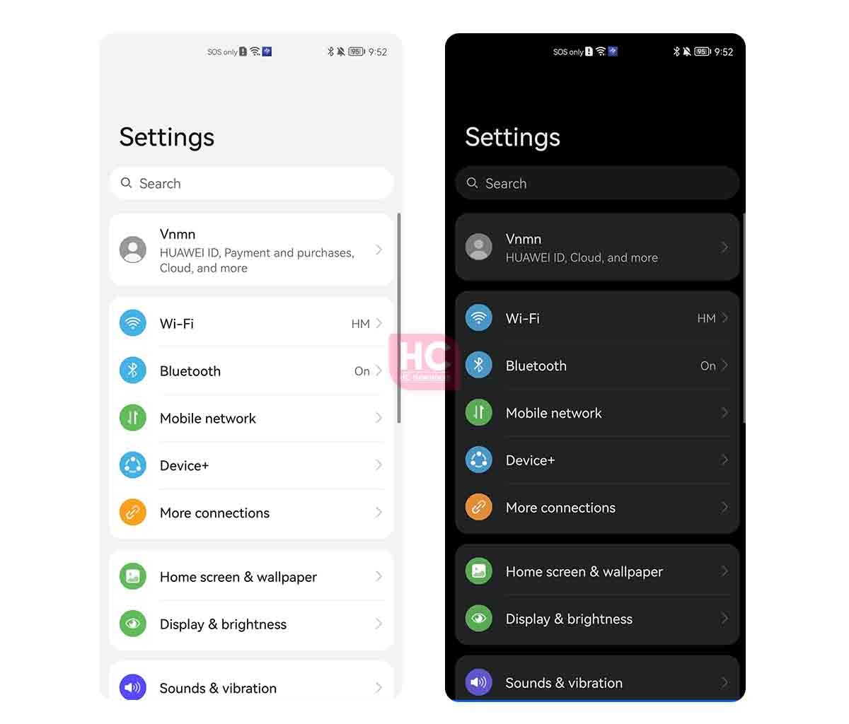
As compared to Android 13, EMUI 12 has its own style and colorful icons to identify each menu option on board. The company has integrated new weightless font that has sufficient contrast and suits well in your eyes. The menu options are divided into sections with background shapes, which helps you to get to a certain types of features in the menu and it’s not available on Android 13.

However, the dark mode changes the game, the appearance of EMUI 12 in Dark Mode is way better than the Android 13, as it continues to keep low contrast and the menu item colors can be easily identified in the low light scenarios.
The post EMUI 12 vs Android 13 Beta: Settings menu appeared first on Huawei Central.
Post a Comment
0 Comments