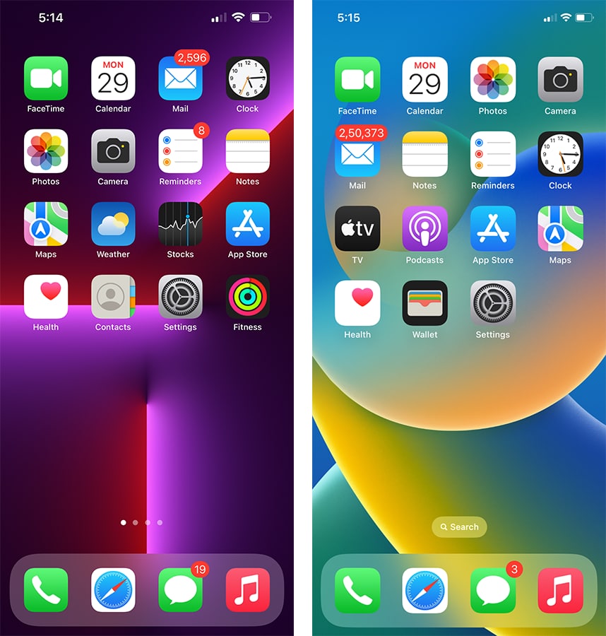
iOS 15 vs iOS 16: Changes in home screen
iOS 16 comes with a number of new additions and slight changes that will enhance your user experience. Yes! There are also new improvements on the home screen and we’ll be going to make a comparison between iOS 15 and iOS 16.
Diving right away, iOS 16 doesn’t bring any major changes to the home screen as the icons, fonts, and notifications indicator remain the same as in iOS 15. However, a major change that you’ll see on the home screen of iOS 16 includes the new “Search” widget above the bottom dock.
Interestingly, this works as a search button but when you switch screens, you’ll see an indicator and as the screen stops, your phone’s screen turns indicators into a search widget.
The rest of the home screen features remain unchanged at the moment, as you can delete any app by tapping and holding on the icon and adding new widgets via the same process. However, iOS 16 is still under beta testing and we may see optimum change with this upcoming version.

The post iOS 15 vs iOS 16: Changes in home screen appeared first on Huawei Central.
Post a Comment
0 Comments