OxygenOS 11 vs HarmonyOS 2: Dark Mode battle
OxygenOS is OnePlus’s prime software system that’s based on the Android operating system, this software currently runs the 11th version – OxygenOS 11 on OnePlus devices.
OxygenOS 11 is quite popular among the OnePlus smartphone users and people are comparing the advantages of this software over Huawei HarmonyOS 2.
So, why not we do the same. Therefore, in the HarmonyOS 2 comparison series, we’re now jumping on the first head-to-head battle between OxygenOS 11 vs HarmonyOS 2.
As we’ll going initiate this comparison with the dark mode feature.
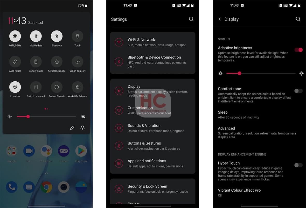
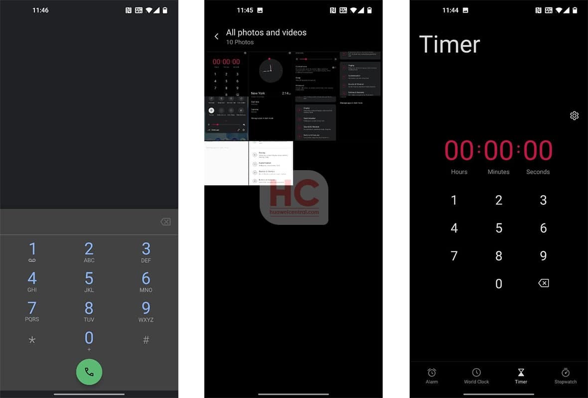
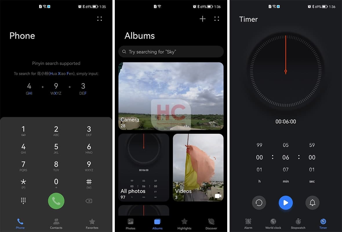
For the OxygenOS 11 vs HarmonyOS 2 dark mode comparison, we’ll test the following user interface element and system apps:
- Quick Settings
- Settings Menu – Menu icons and view
- Apps – Clock, Gallery, and Dial
Let’s begin
OxygenOS 11:
In Dark Mode, the OxygenOS 11 provides a good sense of viewing and has three color combinations of red, gray, and white in the UI elements. Coming to the Settings menu, the card, and menu layout also good but as you move inside any Settings menu, you’ll have to high-contrast colors.
To be mentioned, the colors sometimes feel very odd while operating throughout the software system. On the other hand, the software still allows users to change the theme’s accent color but the dark mode looks too terrible in accent colors.
HarmonyOS 2:
Huawei’s HarmonyOS 2 has a better color combination while using the dark mode, and it includes subtle colors that don’t hurt your eyes. Users could find these subtle changes and perfect color contrast ratio in almost every part of the user interface in the dark mode.
The theme has new menu icons and there’s a lot of optimization that been added to system apps. This helps to provide a better dark mode experience to the users compared to the OxygenOS 11.
Also, Check:
The post OxygenOS 11 vs HarmonyOS 2: Dark Mode battle appeared first on Huawei Central.


Post a Comment
0 Comments