Huawei updated HarmonyOS JavaUI Framework content
Huawei has an important JavaUI framework in the development of HarmonyOS that developers need to adopt to build apps for this operating system. Moving on, based on the feedback from developers and improvement suggestions, the JavaUI framework content of the Huawei HarmonyOS official website document has been updated, which is mainly reflected in the new development guide and development instructions.
1. New component development guide
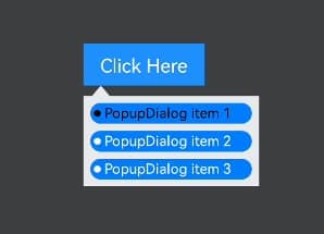
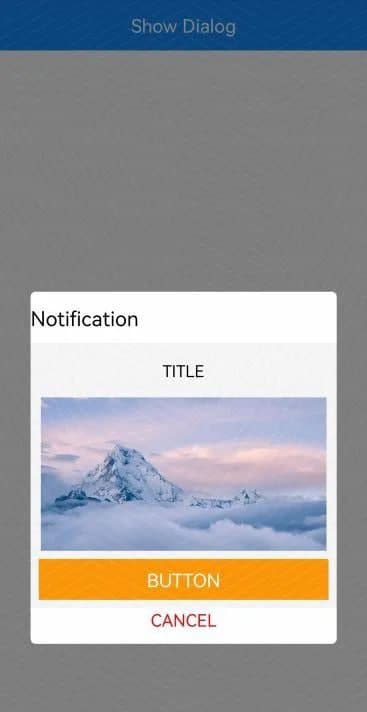
In this update, a new development guide for PopupDialog and CommonDialog components has been added.
PopupDialog component:
PopupDialog is a bubble dialog box that pops up on the current interface, which can be displayed by referring to components or screens. Developers can create a bubble dialog box through the PopupDialog construction method and use common methods such as setArrowOffset, setArrowSize, and setBackColor to set the size, background, and arrow style of the bubble dialog box. In addition, you can also use setCustomComponent to make some custom settings.

For a detailed PopupDialog component development guide, please visit the official website:
https://ift.tt/2W6xd41
CommonDialog component:
CommonDialog is a dialog box in which the user cannot manipulate the contents of other interfaces before the pop-up box disappears. It is usually used to display information or operations that the user currently needs or the user must pay attention to.
Developers can use CommonDialog’s construction method to create a dialog box, and use common methods such as setSize, setOffset, setCornerRadius to set the size, offset, and rounded corners of the dialog box, and then use the setDuration method to set the duration before the dialog box is automatically closed. . Developers can also use setCustomComponent to make some custom settings.

For a detailed CommonDialog component development guide, please visit the official website:
https://ift.tt/3lVcZD2
Supplemental component development instructions:
In this update, on the basis of the original component development guide, the ToastDialog component, Picker component, TableLayout layout, and custom component development guide content have been supplemented, so that developers can more easily understand and master them in the process of reading the document. development process. The following is the content of this supplementary explanation.
ToastDialog component
The ToastDialog component is a dialog box that pops up at the top of the window and is simple feedback for notification operations. This update adds the interface description of the ToastDialog component. Developers can obtain the corresponding construction methods and common methods to better create, use and customize the ToastDialog. ToastDialog component adds interface description content.
ToastDialog component official website guide:
https://ift.tt/3ELMpVB
Picker component
The Picker component provides a sliding selector. In this update, the usage example of the multi-level association of the Picker component is supplemented, so that developers can better develop and realize the scene requirements related to the multi-level Picker association. Picker components are multi-level associations.
Picker component official website guide:
https://ift.tt/3lSkpHh
TableLayout layout:
TableLayout divides the sub-components in a tabular way. This update supplements the usage examples of the row and column properties of the TableLayout sub-components. Developers can achieve the effect of cell merging by setting the row and column properties of the TableLayout sub-components. Use TableLayout to merge cells.
TableLayout layout guide on the official website:
https://ift.tt/3udIE6E
Custom component
Custom components are components created by developers based on design requirements. This update adds the complete sample code of the custom component and adjusts the function of the custom ring component in the document so that the color of the ring can be changed every time you click/lift it. The effect of the custom ring component.
Custom component official website guide:
https://ift.tt/3u3ukgW
Suggestions and feedback:
Huawei said it insists on listening to developers and continuously optimizing the document experience. Developers have any documentation problems and suggestions during the development process, and they can provide feedback in the following two ways:
Directly click the “Feedback” button under the development document to give feedback;
Under the “HarmonyOS” section of the Huawei Developer Forum, click “Post Topic” to give feedback.
The post Huawei updated HarmonyOS JavaUI Framework content appeared first on Huawei Central.
Post a Comment
0 Comments