Samsung One UI 4.1 vs EMUI 12: Quick Settings
One UI 4.1 is the latest installment in the One UI series. The software is designed for efficiency and performance over One UI 4.0 and brings better features for Samsung smartphone consumers. On the other hand, you have the new Huawei EMUI 12, which comes with a variety of new functionalities to suit your Huawei device.
Therefore, two prime software from two prime smartphone makers should be compared. Hence, we’re here to make their spot the different competition sessions between Samsung One UI 4.1 and EMUI 12 quick settings. For this comparison, we’ll go through the user interface and the feature that comes into both of the quick settings.
Let’s begin the One UI 4.1 vs EMUI 12 quick settings comparison below.
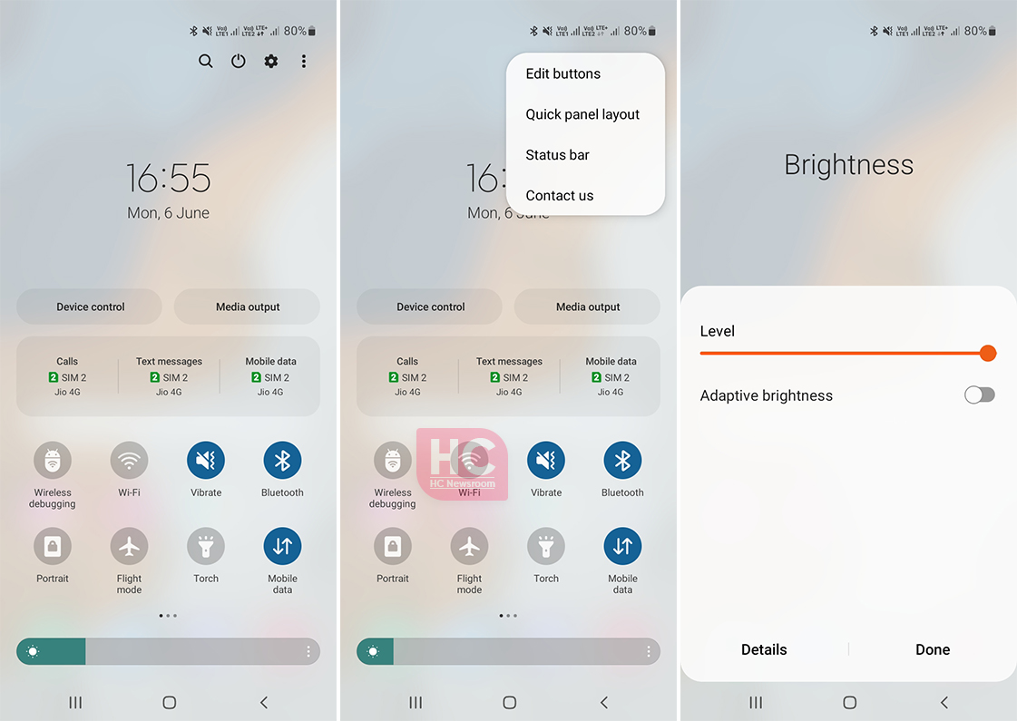
Let’s start with One UI 4.1, the quick settings of this Samsung software look elegant. No doubt that Samsung really focused on the software for better user interaction and ease of access.

Samsung One UI 4.1 quick settings include a sleek design that reflects the user interface. The top bar features an edit menu, settings button, power key, and search. Followed by the date and time labels, and then there are two buttons for Device control to manage connected devices and Media output to manage all of the connected media devices.
There are various SIM card selection options including for calls, text messages, and mobile data. Later comes the quick action switches, that allow you to tap and enable any of the given settings. You will also get options to edit the layout of quick settings along with options to add new or remove old switches from the layout.
EMUI 12 Control Panel:
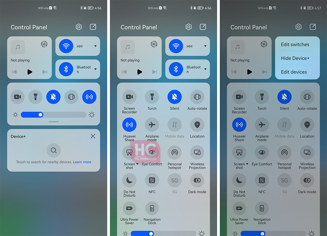
EMUI 12 has its own vibe and Huawei has brought in a new user interface directly from HarmonyOS operating system to this software to make it look intriguing with every launch. Speaking of which, the Control Panel of the EMUI 12 is divided into three sections.

Media, Quick Settings Switches as well as Smart Device management. The Control Panel allows you to edit and manage switch options. You can also hide the smart device section.
The theme of the control panel looks interesting and the separate sections will help you better sort out options as compared to the One UI 4.1 but the virtual power button is still a big bummer for EMUI.
The post Samsung One UI 4.1 vs EMUI 12: Quick Settings appeared first on Huawei Central.
Post a Comment
0 Comments