Google Play Store gets Android Material You buttons
Material You has now been the core part of the Android operating system (Android 12 and later) user interface. Since last year, Google has been working to inherit this new design for all of its Google Mobile Services applications. However, Play Store is a big platform that is not only used for apps but for a wide variety of developers’ APIs, therefore, the Google is making changes swiftly on this Android app marketplace including the latest Material You Design buttons.
According to 9to5Google, Google Play Store has now brought in a fresh design for the buttons system on Android devices powered with Material You design.
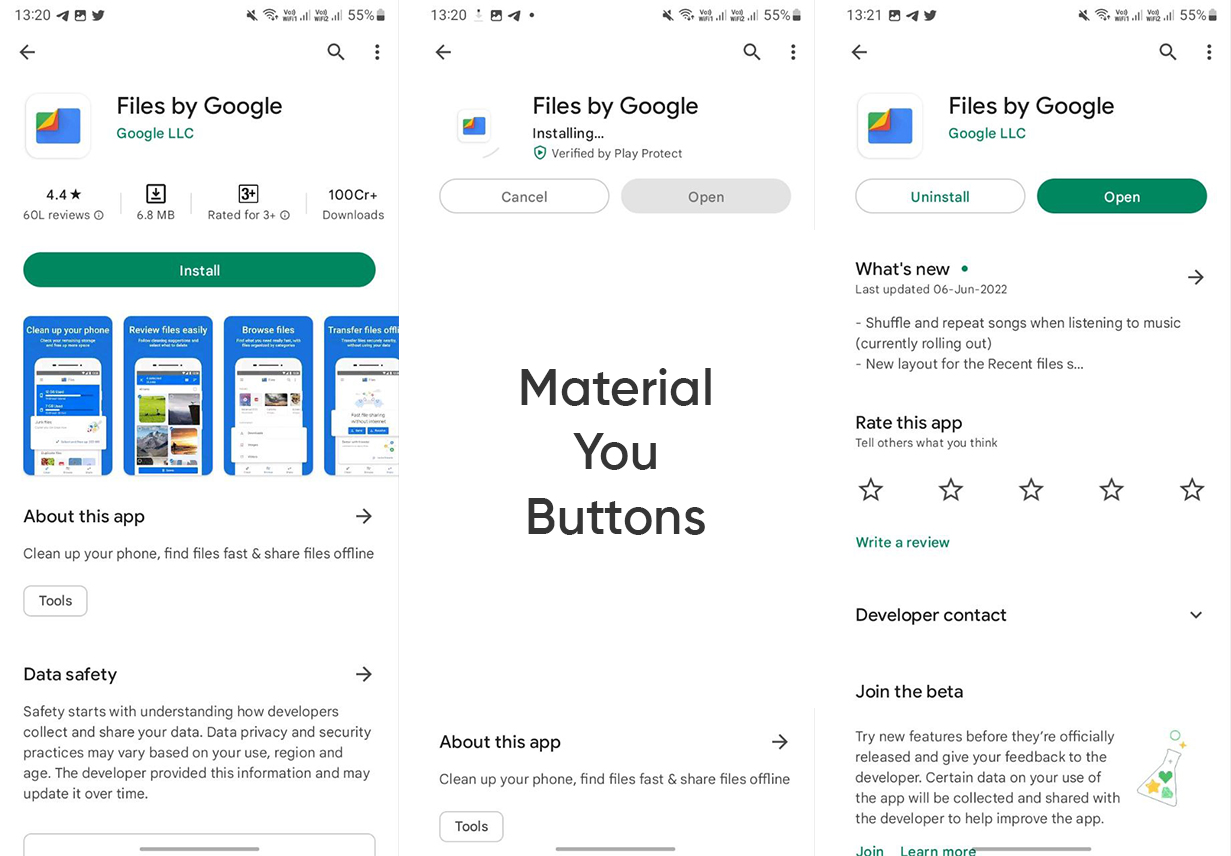
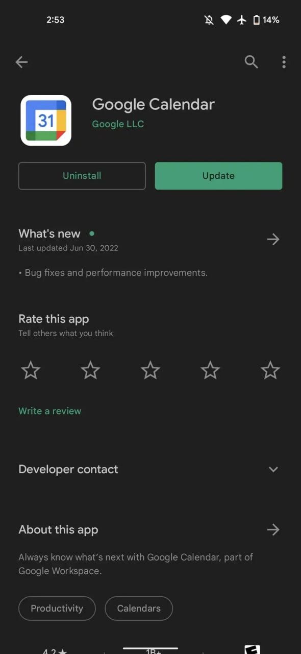
Taking about the changes, the round button design is clearly visible on Install, Install, Cancel, and Open, you can see them once you search for any app or game and proceed with that on the Play Store.

The design of the new button includes round edges and corners to form a pill shape, which was previously not as round as they are now. The new look of the buttons doesn’t include any other changes in color, such as the text and background fill remains green.
However, Google has decided to revert the changes that have been made in other parts of the Play Store app detail interface. A better example appears in the category text below the about section.
(image source – 9to5Google)

As explained above, Google is certain about coating all of its stock Android apps with Material Design and most of them are already under process.
Google published material design tweaks to Play Store in last October. These changes have appeared on the home screen with a new search field, bottom bar, and the dynamic theme color system for these two features respectively.
The post Google Play Store gets Android Material You buttons appeared first on Huawei Central.
Post a Comment
0 Comments